


verifiedfixed.net project
this project page is about this very webbed site you're on right now. woah.
website-ception, without the iframes
basically, i decided i have too many fucking websites (3) and i wanted to condense them down to fewer (2) and also detach them from my Full Name where possible. i wanted to have one site where i can have both my professional content and some personal content and not be afraid that those two are mixing because it's kind of fucking cool. "but sev, isn't that kind of dangerous in this day and age, isn't that non-professional?" frankly i am at the stage in my life where if an employer is provided a link to my webbed site and immediately takes issue with it in some regard, i do not wish to work for them! it's that simple. at my first ever Real Adult Job my supervisor found my tumblr by eavesdropping on me talking to a friend and used it to send me sexual harassment and death threats, if you think i don't know a potential employer can find anything i put on the internet anyway you're sorely mistaken and i'd rather just have it out there and known than keep hiding who i am. (is this an ironic contradiction of my "internet privacy now!" button in the marquee? no, it's just a sad reality.)
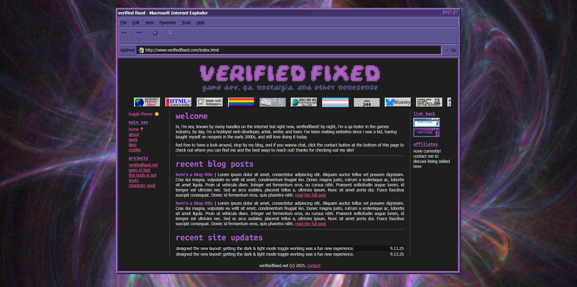
but i also didn't want to like. lose the cool nostalgic styling i did on my original website! i put in SO much work to make it look like oldschool windows 95 (what i grew up using) and i really enjoy that, but i wanted it to be, well. a lot more usable, at least on desktop! because let's be real this one's a bit less useable on mobile but that's fine, i didn't prioritize it for mobile usage.
one thing that i really wanted to include that the last site i made did not have is a light and a dark theme, and the ability to toggle between them, just in case you're a freak like me (read: visual snow sufferer, lol) who uses different themes on different devices or different sites or apps! the latter part was really important to me, i didn't just want it to be set based on what user device preference was, but i wanted people to be able to toggle between them.
doing that was a lot more simple than i thought it would be! at first, i thought i might need some js or something to do it, but all the prebuilt options i looked at couldn't do the simplest of things (like animating a button) correctly out of the box. it seemed overcomplicated and unnecessary, so i thought, there has to be an easier way to just change the colors, i've done things like that a hundred times just not for light/dark mode purposes, so let's think outside the box.
the most promising resource i could find for doing it only with css wanted me to basically duplicate every single css element that needed to update, one with the default colors defined as a variable and the other with the variables updated using :has(#theme:checked) ("theme" being the label id of my secret checkbox to toggle to the other theme) but that was unnecessarily complex, messy, and broke the more i tried to do with it. "there has to be an easier fucking way to define variables than this. i KNOW there's an easier fucking way to define and update variables than this."
my time making custom tumblr themes reminded me i can literally just define variables at the root of the page CSS, so i decided to try going that route and then just changing them on root on toggle. if i had changed my google search terms a bit, i would have discovered that this is pretty much universally the exact suggestion for what i was looking to do in the first place. oh well, a couple more hours spent to come to the same solution! duplicating and swapping my themes for prefers-color-scheme support and this is what it looks like.
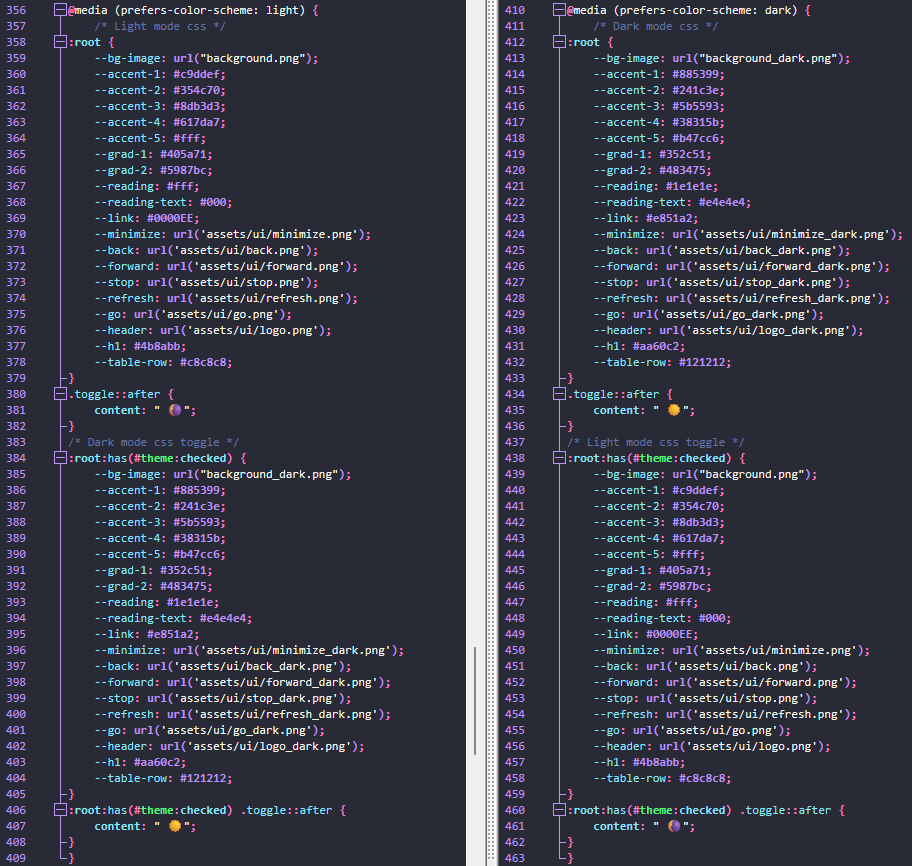
"sev... that's the same thing four times basically." yeah. pretty neat.
the other thing i really wanted to have was a marquee. just because i miss the days of web1.0 when there were things like marquees and glow fonts and just general eyesearing bullshit no one could stand to look at but everyone wanted. this was also very hard to implement, though, lol. every other keyframe animation i tried gave me a hassle and in the end i still ended up having to shift it like 10px to the left for some reason... maybe due to flex gap or something? i don't know. it works, i didn't care enough to keep digging into it much more. i did make sure it pauses for people who have prefer-reduced-motion on, and it pauses when you hover.
i didn't really know what to put IN the marquee, but as a test i shoved a bunch of 88x31 buttons in there. i liked it so i kept it. why not!
you may be asking, "sev, why the name 'verifiedfixed'?" it's just a little funny username i started using awhile ago. part QA joke ("verified fixed" is what one company i worked for uses as their "yeah this bug is no longer occurring so this fix can be pushed live," there's not really a standard for this in the QA world like there is for things like CNR, WNF, NAB, etc.) and part joke about finally being sterilized. what can i say. i love the little home i've found for myself in QA, it's a good job to have :)
from there everything else was smooth sailing, just migrating over the blog and comments i already had installed on my other site and making project pages for each project i planned to have a page for. woo! pretty happy with how it all turned out in the end!

